
How to Add Realistic Shadow Creation to Product Photos
Product photos can look flat or unfinished when they don’t have the right shadows. Realistic shadow creation help give products a sense of depth and weight, making them feel more real to the viewer. They guide the eye and help the product stand out without stealing attention from it. When done right, shadows quietly support the image and make everything feel balanced. This small detail can make a big difference in how professional your photos look.
Learning how to add realistic shadows doesn’t have to feel complicated or technical. With the right approach, you can create shadows that look natural and blend smoothly with the product and background. It’s all about understanding light, direction, and softness so the shadow matches the scene. Even if you’re working on product listings, ads, or a brand portfolio, good shadows help your images feel more believable. Once you start paying attention to this detail, you’ll notice how much stronger your product photos become.
Why Shadows Matter in Product Images
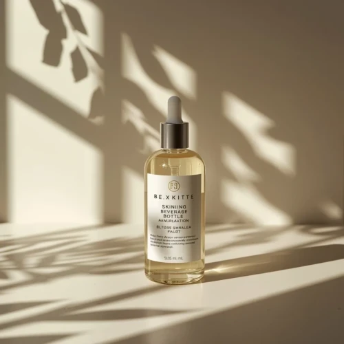
Shadow creation plays a bigger role in product images than many people realize. They help give products a sense of depth, making them look like they belong in the space instead of floating unnaturally. Without shadows, even high-quality products can appear flat or unrealistic. A well-placed shadow adds balance and helps guide the viewer’s eye toward the product. It quietly supports the image without taking attention away from what’s being shown.
Shadow creation also help create a more natural and trustworthy look. They reflect how light works in real life, which makes the product feel more believable to customers. When shadow creation are done right, they add dimension while keeping the focus on the product itself. This small detail can improve how professional and appealing your images feel. In product photography, shadows are often the difference between an average photo and one that truly stands out.
Understanding Shadow Creation for Products
Shadow creation plays an important role in how a product looks and feels to the viewer. When used correctly, they guide the eye and highlight the product’s shape, size, and key features. Soft shadows often create a clean and professional look, while stronger shadows can add drama or emphasis. The goal is not to distract but to support the product visually. Good shadows make products feel grounded and believable in their environment.
Different types of shadows work better for different products and uses. Natural shadows are commonly used in lifestyle or realistic scenes, while drop shadows are popular in e-commerce and graphic design. The direction, softness, and darkness of a shadow all affect how the product is perceived. Poorly placed shadows can make a product look unnatural or poorly edited. Consistency is also important, especially when displaying multiple products together. Understanding shadow basics helps create visuals that look polished and trustworthy. Want to see the difference for your products? Send us a sample photo, and we’ll show you how professional shadow creation can make it look more appealing.
Helpful tips for creating better product shadows:
- Match the shadow direction with the light source for a natural look
- Use soft edges for clean and professional product images
- Keep shadows simple so they don’t overpower the product
- Adjust shadow opacity to fit the background and setting
- Stay consistent with shadows across all product images
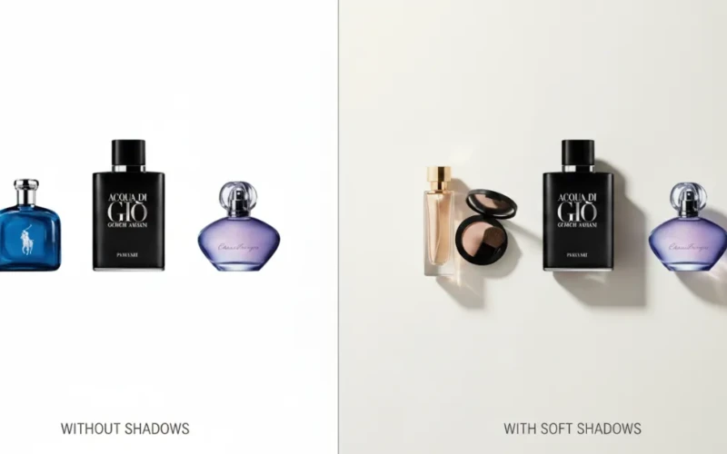
Common Shadow Types Used in Product Photos
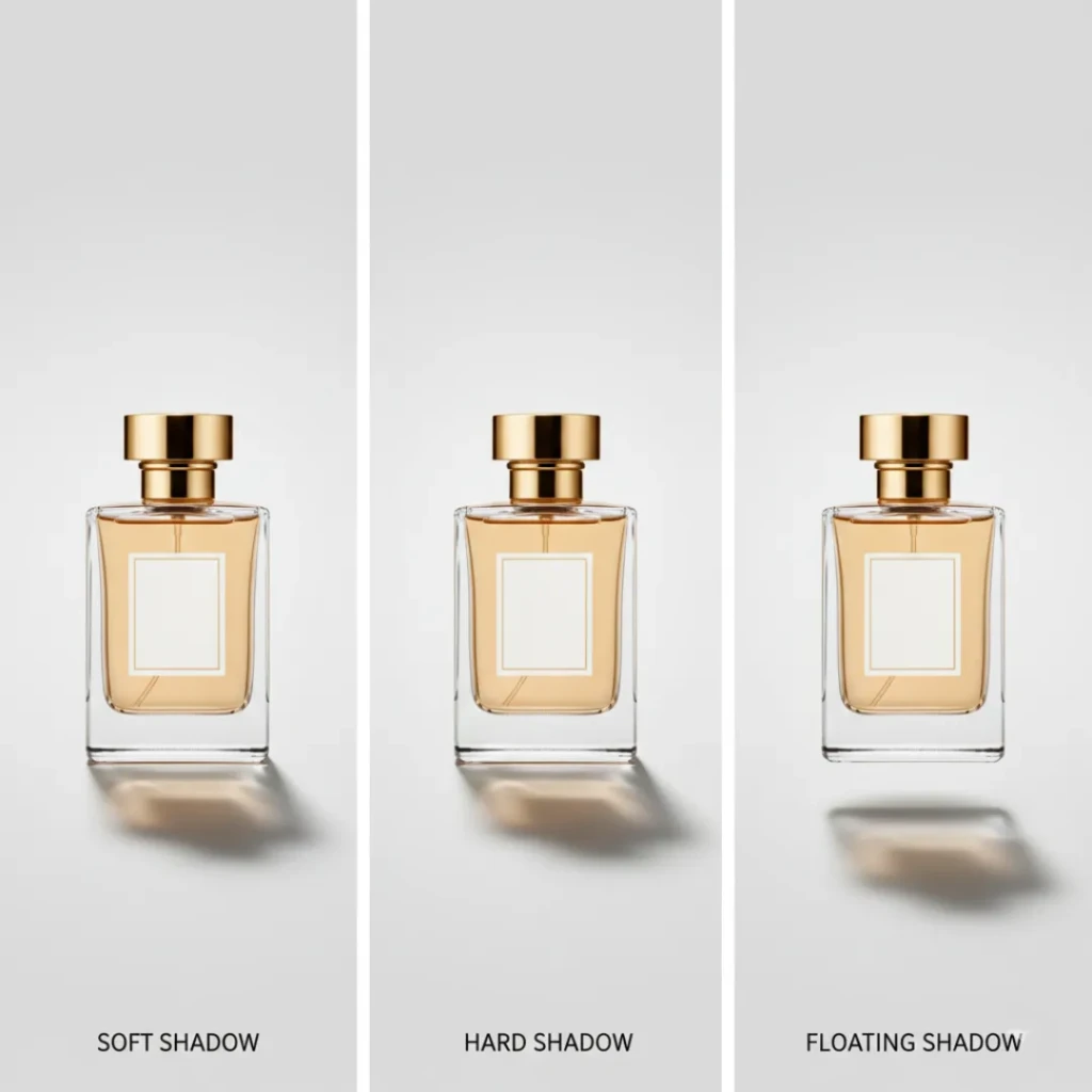
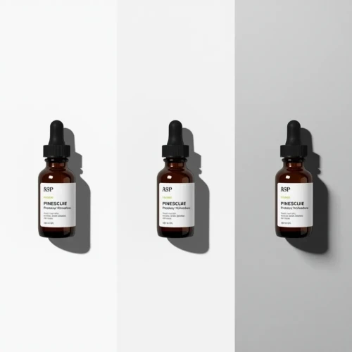
In product photos, different shadow types are used to change how a product feels and how real it looks. Soft shadows are the most common because they look natural and don’t pull attention away from the product. Hard shadows have sharp edges and create a bold or dramatic look, which works well for fashion or creative shots. Drop shadows are often used in online stores to help products stand out on clean backgrounds. Natural shadows come from real lighting setups and are popular in lifestyle images. Floating shadows are more modern and make the product appear slightly lifted. Each shadow type serves a different purpose, so choosing the right one depends on how and where the image will be used. For example, ecommerce listings usually look better with simple and clean shadows that don’t distract shoppers.
Lifestyle photos benefit from shadows that match the environment and light source. Overusing strong shadows can make a product look fake or too edited. Consistency is also important, especially when showing multiple products together. When shadows feel balanced and natural, the product automatically looks more professional.
Helpful tips for choosing shadow types:
- Use soft or drop shadows for ecommerce and catalogs
- Match the shadow direction with the light source
- Keep shadows simple so the product stays the focus
- Avoid mixing different shadow styles in the same product set
- Test different shadows and choose what looks most natural
Choosing the Right Shadow Style
Selecting the right shadow creation style is key to making a product image look polished and realistic. Different shadow styles can completely change how a product feels to the viewer. For example, a soft shadow can give a clean, simple, and professional appearance, while a hard shadow adds drama and depth. The choice often depends on the product type, its environment, and the overall mood you want to create. Shadows should improve the product, not distract from it, and they should match the lighting in the scene. Paying attention to size, direction, and blur of shadows helps create a balanced and natural look.
It’s also important to consider where the product will be displayed. Online stores often use floating or drop shadows to make products stand out against plain backgrounds, while lifestyle photos benefit from natural shadows that match the environment. Shadows should remain consistent across similar products to maintain a cohesive visual style. Experimenting with shadow styles while keeping the product as the focus can improve both appeal and realism.
Tips for picking the right shadow style:
- Match shadow hardness to the product’s setting (soft for clean, hard for dramatic)
- Use natural shadows for realistic scenes and drop shadows for isolated products
- Consider the light direction and intensity to maintain consistency
- Keep shadow color simple; pure black often looks unnatural
- Test different opacity and blur levels to find the most balanced look
Simple Steps to Shadow Creation
Creating shadows to product images doesn’t have to be complicated. The first step is to understand the light source in your scene. Shadows should fall in the same direction as the light and match its strength strong light creates sharp shadows, while soft light creates gentle ones. Next, decide on the type of shadow you need natural shadows work well for lifestyle settings, while drop shadows are ideal for isolated products on plain backgrounds. Once you have your shadow type, place it carefully under or behind the product so it feels grounded and connected to the surface. Always check that the shadow’s size and angle look consistent with the product and surrounding elements.
After placement, adjust shadow properties to make it look realistic. Softening the edges and lowering opacity often makes shadows blend naturally. You can also slightly blur or distort shadows to match the surface texture beneath the product. Avoid making shadows too dark or too perfect, as this can make the image feel fake. Consistency is key, especially if you’re editing multiple product images for the same collection. Practicing these steps will gradually make adding shadows faster and more natural.
Here are some simple tips:
- Observe real-world lighting before creating shadows
- Match shadow direction and length to the light source
- Use soft edges for a natural look, harder edges for dramatic effect
- Adjust opacity and blur to fit the scene and background
- Keep shadows simple to make sure that the product remains the focus
If you want professional-looking product images without the guesswork, feel free to explore our services or take a look at our portfolio to see how realistic shadows can help improve your products.
Shadow Creation Mistakes to Avoid in Product Photos
When adding shadows to product photos, there are a few things that should be avoided to keep images looking real. Shadows that are too dark can overpower the product and make it feel heavy or fake. Another thing to avoid is placing shadows in a direction that doesn’t match the light source. If the shadow feels disconnected from the product, it can look like the item is floating for the wrong reason. Overusing strong or dramatic shadows can also distract viewers from the product itself. Keeping shadows simple usually gives better results.
It’s also important to avoid rushing the editing process. Adding too much blur can make shadows look cloudy or unnatural. On the other hand, shadows with no blur at all can appear flat and harsh. Inconsistent shadows across similar product images should be avoided, especially in online stores. Ignoring the surface or background can cause shadows to stand out in a bad way. Paying attention to small details helps keep the image clean and professional.
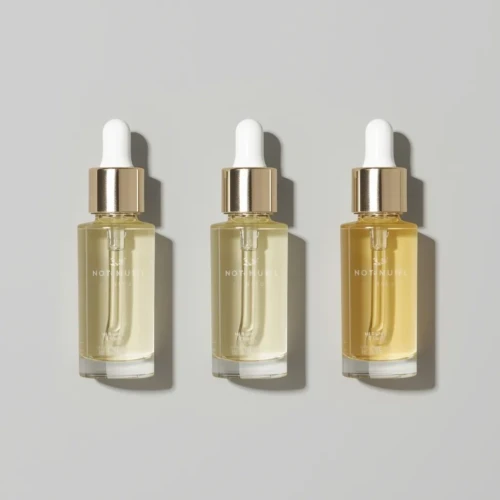
Keeping Shadows Consistent Across Products
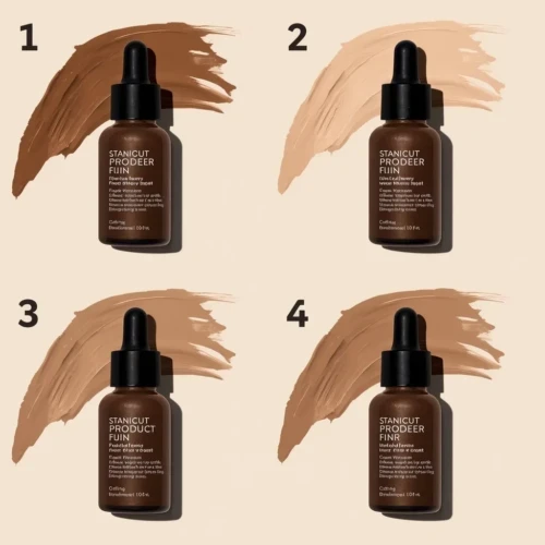
Using the same shadow style across all product images helps create a clean and professional look for your brand. When shadows are uniform, products feel like they belong together, even if they are different sizes or types. This makes online stores and catalogs easier to browse and more pleasant to look at. Consistent shadows also help customers focus on the products instead of noticing visual differences between images. Overall, it builds trust by showing attention to detail.
In product listings, inconsistent shadows can make a page look messy or unfinished. Some products may appear heavier, lighter, or out of place if the shadows don’t match. Uniform shadows help maintain balance and make layouts feel organized. They also strengthen brand identity, especially when customers see your products repeatedly across different platforms. A consistent shadow style may seem small, but it plays a big role in making product photos look polished and reliable.
Final Tips for Natural and Clean Results
To achieve natural and clean-looking shadows, always start by understanding where the light is coming from. Shadows should feel like a natural result of the lighting, not something added later without thought. Keeping shadows soft and simple usually works better than making them dark or dramatic. Small adjustments in blur and opacity can make a big difference in realism. When in doubt, less is often more.
It also helps to stay consistent with your editing style across all product images. Preview your photos at different sizes to see how the shadows look on screens and product pages. Avoid over-editing, as too many effects can make the image look unnatural. Pay attention to the surface and background so the shadow blends smoothly. Clean, simple shadows help the product stand out while still looking real.
Conclusion
Realistic shadows may seem like a small detail, but they can completely change how your product photos feel. When shadows are done right, they add depth, balance, and make products look more natural and professional. The good news is you don’t need advanced skills to get better at it just a little practice and attention to light and softness. Once you start noticing shadows, you’ll see how much they improve the overall image. Every product and scene is different, so experimenting is part of the process. Have you tried adding shadows to your product photos before, or do you have tips that worked for you? Share your thoughts in the comments we’d love to hear your experience.
Read Next: Editing Pictures in Photoshop Made Easy: Tools You Should Know