
Creative Color Grading That Sets Your Photos Apart From the Rest
Creating amazing images isn’t just about taking a good photo, it’s about making your visuals stand out. One of the most powerful ways to do this is through color grading for photos. With the right colors and tones, even an ordinary picture can feel vibrant, emotional, and professional. Color grading helps highlight the mood, bring out details, and create a consistent style across your work. If you’re a beginner or an experienced photographer, learning how to adjust colors can completely transform your images. It’s a simple step that makes a big difference in how people see and feel your photos.
The beauty of creative color grading is that it allows you to put your personal touch on every shot. You can experiment with warm tones, cool blues, or dramatic contrasts to tell your story visually. Each choice sets your photos apart from the rest and gives them a unique style. It’s not just about technical edits, it’s about expressing your vision and making your images memorable. Once you understand the basics, color grading becomes a fun and creative part of your workflow. With practice, every photo you edit can shine in its own special way.
Why Color Grading for Photos Matters
Color grading for photos is more than just changing colors, it’s about creating the mood and feeling of your images. The right tones can make a photo look warm, dramatic, or vibrant, and they help draw attention to the important parts of your picture. It also gives your photos a consistent style, which is especially useful if you’re sharing images on social media or building a personal brand. Without proper color grading, even a well-shot photo can look flat or unremarkable. By learning simple color grading techniques, you can take your pictures from ordinary to professional-looking in just a few edits.
Using color grading also makes your photos more memorable and engaging for viewers. Small adjustments can highlight details, improve lighting, and create a polished final image.
Here are a few tips to keep in mind when color grading your photos:
- Start with adjusting brightness and contrast to make your image clear.
- Use warm or cool tones to match the mood you want to convey.
- Keep your color palette consistent across multiple photos for a recognizable style.
- Avoid over-editing, which can make images look unnatural or harsh.
- Experiment with different filters or presets, but always tweak them to fit your photo.
Easy Ways to Start Color Grading for Photos
Starting with color grading for photos doesn’t have to be complicated. Even small adjustments can make a big difference in the mood and quality of your images. The goal is to improve your photos naturally, making them more vibrant and professional without overdoing it. You don’t need expensive software, many free or beginner-friendly tools allow you to adjust brightness, contrast, and colors easily. With these techniques, you can make your photos stand out and create a style that feels uniquely yours. Practicing color grading also helps you understand how colors affect the way viewers feel about your images. By experimenting with different tones and styles, you’ll learn how to highlight key details, improve lighting, and create consistency across your photos. The more you practice, the easier it becomes to recognize which adjustments work best for each shot.
Here are some easy ways to start:
- Adjust exposure and brightness – Make sure your photo isn’t too dark or too bright.
- Play with contrast – Make the lights lighter and the darks darker to add depth.
- Use color balance – Add warm or cool tones to set the mood.
- Experiment with saturation – Boost or reduce colors to make your subject pop.
- Try presets or filters – Start with ready-made options and tweak them to fit your photo.
Tips to Make Your Photos Stand Out
Making your photos stand out isn’t just about taking a sharp picture, it’s about creating a look that grabs attention. Color grading for photos plays a big role in this by helping you set the mood, highlight important details, and give your images a consistent style. Even small edits can make a photo more eye-catching and memorable. By focusing on creative color choices and careful adjustments, you can turn ordinary images into professional-looking visuals that people remember.
Consistency and creativity are key to making your photos unique. Developing your own editing style helps your work stand out, If you’re sharing on social media or building a portfolio. Paying attention to lighting, tones, and color harmony can make a huge difference in how your audience perceives your photos. Over time, practicing these techniques will allow you to create images that are not just pretty, but visually striking and full of personality.
Here are some tips to help your photos stand out:
- Highlight the main subject – Use color and contrast to draw attention to what matters most.
- Keep a consistent style – Stick to similar tones and color palettes across your photos.
- Experiment with creative tones – Try warm, cool, or dramatic colors to create mood.
- Adjust shadows and highlights – Improve depth and dimension in your images.
- Focus on small details – Sometimes simple changes can make your photos more polished.
Avoid Common Color Grading Mistakes
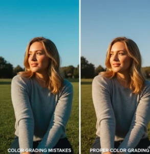
Even with the best intentions, color grading for photos can sometimes go wrong. Over-editing, unrealistic tones, or inconsistent colors can make an image look unnatural and distract from its main subject. Many beginners focus too much on filters or presets without understanding how colors interact, which can reduce the overall quality of their photos. Knowing the most common mistakes helps you avoid them and makes your images look polished, professional, and visually appealing.
Learning from mistakes also helps you develop a stronger editing style. By paying attention to balance, consistency, and simply, you can create photos that feel natural yet striking. Simple awareness of these pitfalls can save time and make your workflow much smoother.
Here are common color grading mistakes to avoid:
- Over-saturating colors – Too much color can look fake or harsh.
- Ignoring skin tones – Keep natural tones when editing portraits.
- Inconsistent color palettes – Avoid random colors across multiple photos.
- Overusing filters or presets – Always tweak edits to suit each image.
- Neglecting shadows and highlights – Improper adjustments can flatten your photo.
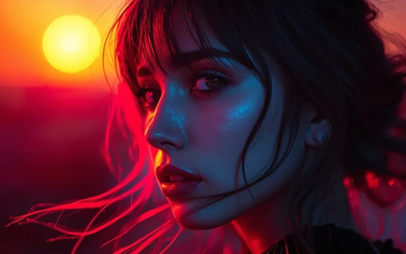
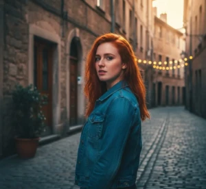
Inspiring Examples of Color Grading for Photos
Seeing inspiring examples is one of the best ways to understand the power of color grading for photos. When you look at well-edited images, you can notice how different tones, contrasts, and color choices affect the mood and overall feel of a photo. Some images use warm tones to create a cozy, inviting atmosphere, while others use cool or dramatic colors for a bold, cinematic effect. By studying these examples, you can learn what works and find ideas to apply to your own photos. Inspiration from real-world edits can also help you develop your unique style faster.
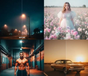
Learning from examples doesn’t mean copying, they’re meant to guide and spark creativity. Observing how professional photographers or successful social media creators handle color can help you experiment safely. Over time, you’ll be able to combine techniques and create your own signature look.
Here are some inspiring ways to see and use color grading effectively:
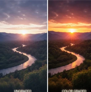
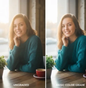
- Before-and-after comparisons – See how small edits transform an image.
- Cinematic color palettes – Study film-inspired tones to add drama or mood.
- Seasonal tones -Use colors that reflect seasons, like warm autumn hues or cool winter blues.
- Vibrant product shots – Look at examples that make products pop for marketing photos.
- Portrait highlights – Notice how skin tones and lighting bring subjects to life.
Conclusion
Creative color grading for photos is a game-changer for anyone looking to make their images stand out. With the right tones and careful adjustments, even ordinary photos can feel vibrant, emotional, and professional. The best part is that it allows you to express your own style and bring a unique personality to every shot. Remember, practice and experimentation are key, don’t be afraid to try different colors, moods, or filters to see what works best. Now it’s your turn: which color grading techniques do you love using, or what’s your favorite way to make photos pop? Share your thoughts and tips in the comments below, we’d love to see your creativity in action.
Read Next: Why Professional Photo Retouching Services Save You Time and Effort